The GetDPI Photography Forum

Great to see you here. Join our insightful photographic forum today and start tapping into a huge wealth of photographic knowledge. Completing our simple registration process will allow you to gain access to exclusive content, add your own topics and posts, share your work and connect with other members through your own private inbox! And don’t forget to say hi!

Fun with the Leica M Monochrom

ashwinrao1

Active member
Hi Dave,
The "vintage" shot was taken with a 50 mm f/2 Rigid Summicron (chrome), probably my favorite vintage lens (since I am generally a 50 guy)

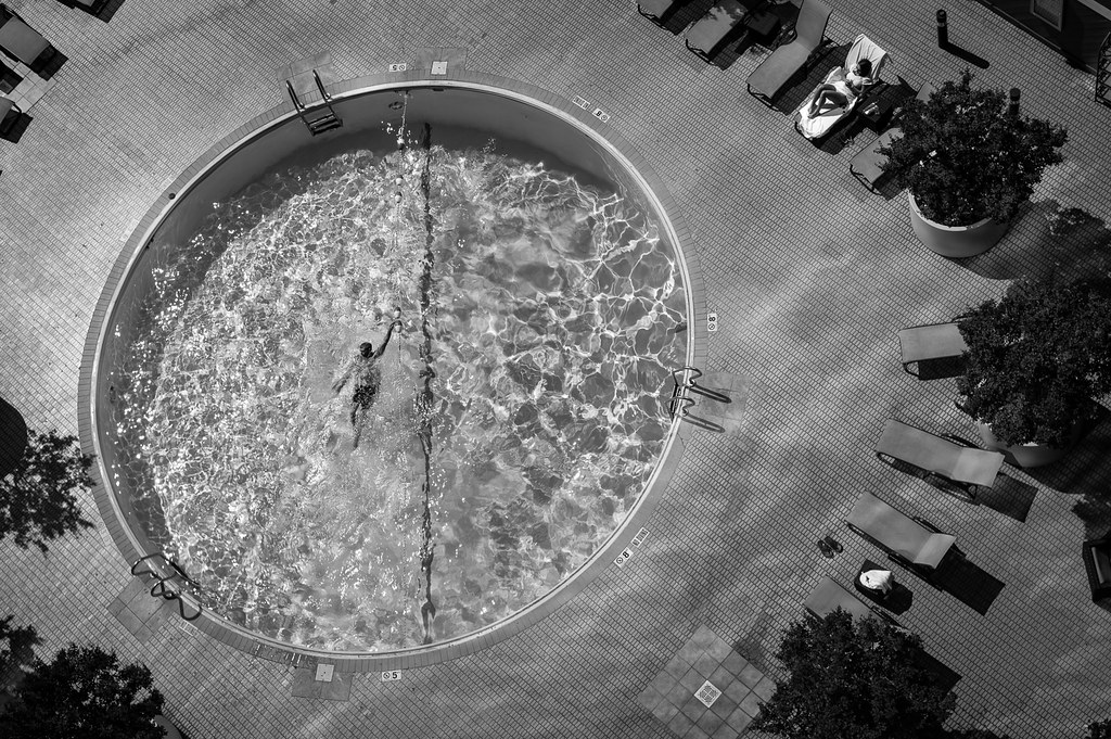
As for wider croppage, here you go (wasn't wide enough to get all of the chairs):
 

D&A

Well-known member
Hi Ashwin,

The widest of the crops (pool shot) looks great and not sure if a wider one existed that it would be better. This one leave something to the imagination and has a great nostalgic look to it.

As for other shot with the two gentlemen, upon first look, the bokeh of that shot looked like it came from a vintage lens. The more I see shots taken with the rigid cron, the more I like! Thanks for responding with the info and wider crop.

Dave (D&A)
 

Woody Campbell

Workshop Member
H
. . .

As it is (and would be), almost reminds me of an iconic shot from the 50's!

. . . .

Dave (D&A)
As indeed it should. Many, many of the iconic shots of the 50s and 60s were in fact taken with the rigid summicron or its optical twin, the dual range summicron. I have the latter and it's my most used lens.

BTW I too like the widest crop.
 

Shashin

Well-known member
Hi Dave,
The "vintage" shot was taken with a 50 mm f/2 Rigid Summicron (chrome), probably my favorite vintage lens (since I am generally a 50 guy)

As for wider croppage, here you go (wasn't wide enough to get all of the chairs):

I actually like this version the best. I hate to articulate why I like photos because the words don't actually fit what I feel. But this shows a this small pool of water almost artificially placed (or punched out) in another artificial plane of tiles. The surrounding chairs give more a sense this is an arena where folks come to view the activity in the pool. It also puts a greater emphasis on the strange orientation of the plane of the ground that seems to be tilting and falling away and when combined with the water, there is a sense of vertigo. And there are small details like the single person in the chair and the sandals next to the empty chair--presumably belonging to the swimmer. While the crops are very graphic, there is a greater mystery for me in the whole frame.

But that is really not what I feel...
 

D&A

Well-known member
As indeed it should. Many, many of the iconic shots of the 50s and 60s were in fact taken with the rigid summicron or its optical twin, the dual range summicron. I have the latter and it's my most used lens.

BTW I too like the widest crop.
That makes the combination of the rigid Summicron and The MM quote potent. Nice!

Dave (D&A)
 

Paratom

Well-known member
Those are from camera jpgs with high contrast setting (by fault I disabled raw).
MM with the 135mm.
Normally I would have probably made this image in color, but being forced to b&w I like the result better than I thought when taking the image.
One of the reasons I like the MM...it makes me to take different approach.
 

docmoore

Subscriber and Workshop Member
Woody,

There is a very distracting circular gradient in the outer edges of all three captures....

Any idea as to the source of this?


Bob
 

GrahamWelland

Subscriber & Workshop Member
Woody,

There is a very distracting circular gradient in the outer edges of all three captures....

Any idea as to the source of this?


Bob
Interesting - they almost look like interference rings radiating outward s from the lens centre. Filter maybe?
 

m_driscoll

New member
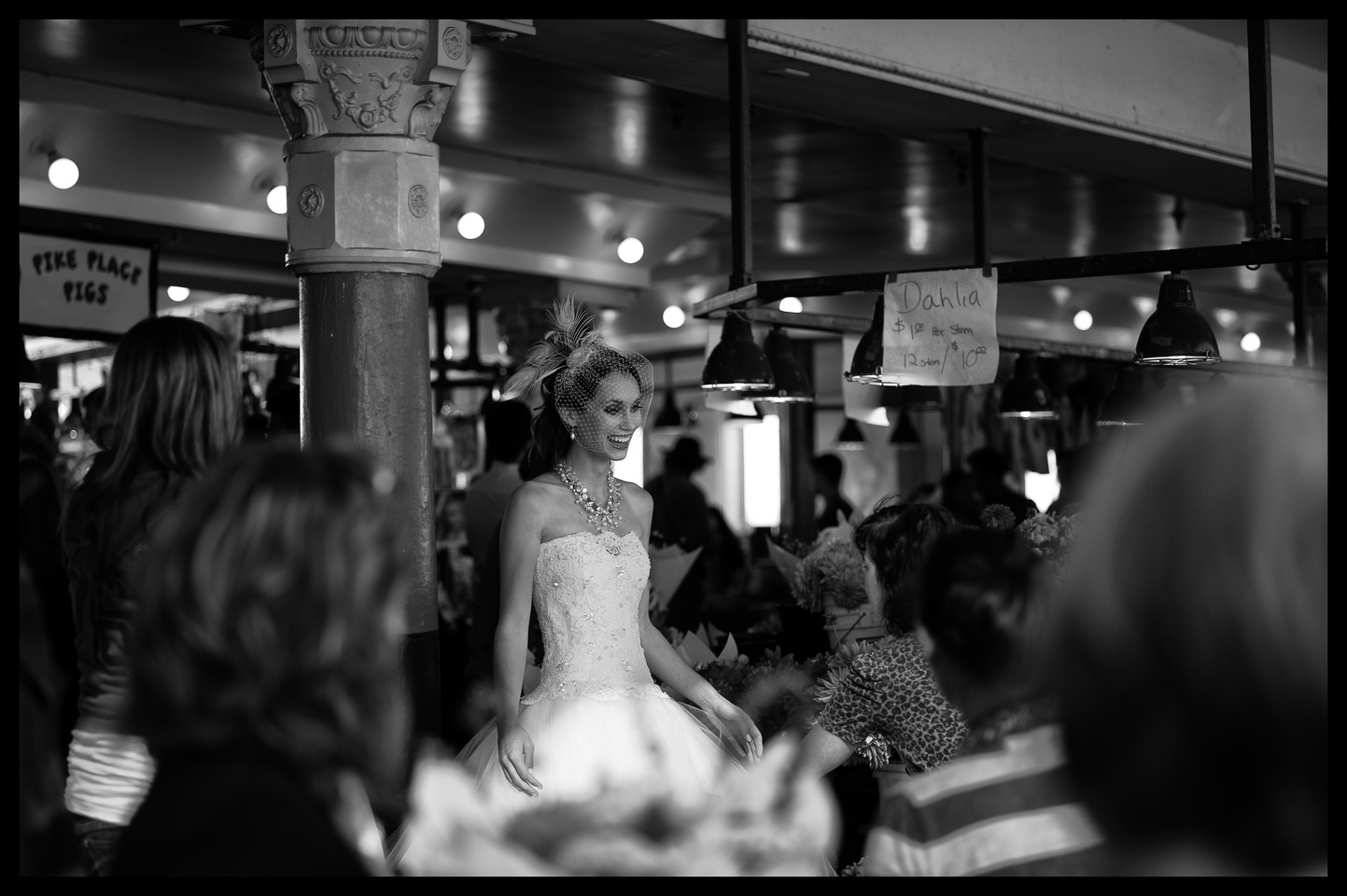
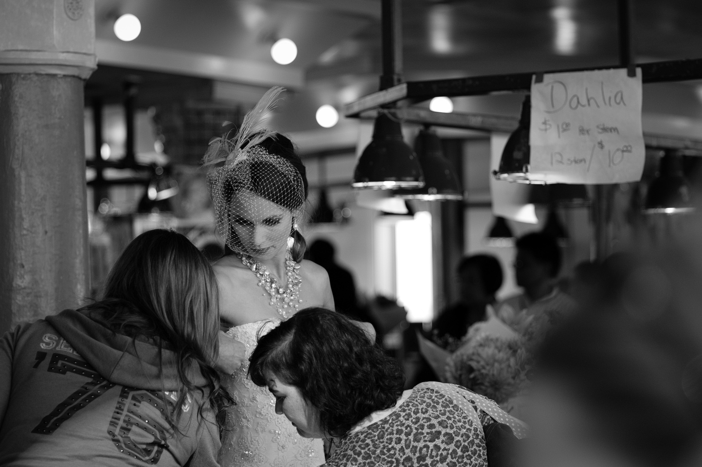
A few more from the Pike Place Market.

M-M; 75mm f/2.5; 1/1000s; -2/3 EV; ISO 320


M-M; 75mm f/2.5; 1/1000s; -2/3 EV; ISO 320


M-M; 75mm f/2.5; 1/1000s; -2/3 EV; ISO 320


Cheers, Matt
 

downstairs

New member
Quick but not dirty. Three jpegs blended in Photomatix. Unfortunately Photmatiix returns a colour RGB - not cricket.
 

Daure

Member
Really weird. Not evident at all viewing the original files in LR. Something between there and here. They look like moires.
I had the same problems with my 50 Lux and 35 Lux.
Without filter.
Came from the lens correction profiles in LR4.
Simply not use these lens profiles.
Certainly not thought for MM files, but for color files :facesmack:
The problem is more visible after a jpeg conversion and Size compression.
Hope it's useful.
 

Woody Campbell

Workshop Member
I had the same problems with my 50 Lux and 35 Lux.
Without filter.
Came from the lens correction profiles in LR4.
Simply not use these lens profiles.
Certainly not thought for MM files, but for color files :facesmack:
The problem is more visible after a jpeg conversion and Size compression.
Hope it's useful.
Very very helpful - there were about two dozen candidates in my mind and I was going to have to go through them one at a time (export sharpening was at the top of my list). I'll start here.
 
Top